
To lead more users to your products, you need to create a showstopping landing page. To do this, you’ll need to consider your audience, your call-to-action, the product or service, and your niche.
Beautifully-crafted landing pages focus on giving potential clients the down-low on your product quickly. If you can marry this with visually appealing graphics, a clean and organized template, and social proof, then you are well on your way to creating landing pages that convert.
Here are a few samples of landing pages that just plain work:
1. Unbounce

Unbounce is the top example of an excellent landing page because it has all of the required elements—from the catchy headline to the simple CTA copy and visually appealing screenshots. These guys make a living from designing landing pages so we can expect their pages to be nothing short of brilliant.
The overall design of Unbounce’s landing page banks on SEO, and there is enough content to keep readers engaged with the site before they complete the next action. On the other hand, the details do not distract visitors at all because they’re all below the fold and only evident upon scrolling.
2. Wistia
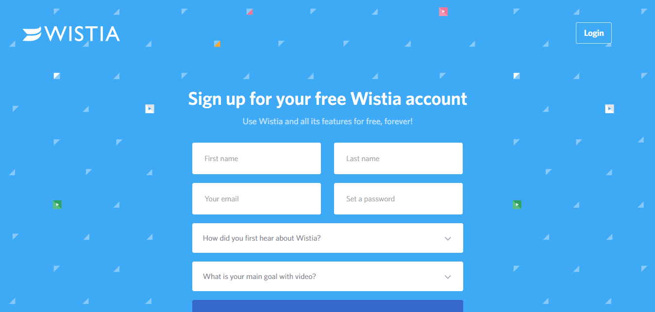
Wistia’s smart contrast of blue and white is visually stimulating. Added to that is the sign-up form, which visitors see the moment the page opens. The form for creating an account is strategically placed on the site, while FAQs to answer a visitor’s queries are placed at the bottom. External links have been removed, and there is nothing to distract users from their next action.
3. H.Bloom
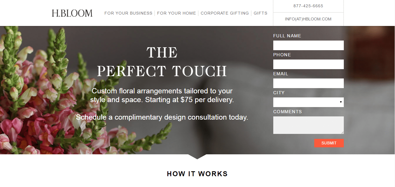
H.Bloom combines a few important elements of an engaging landing page: beautiful and captivating images and a minimalist template. The white space on the page allows visitors to take in all the images and details, as too many fancy designs on the page can distract users from the main objective.
It has an above-the-fold form and a brief explanation of what happens when you fill it out. The “Submit” button is not to be missed because of its bright color.
4. American Bullion
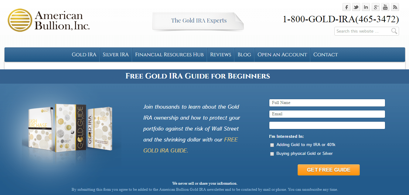
American Bullion’s catchy headline tells readers right off the bat what the page is all about. This saves them from having to browse the whole page.
The introductory paragraph gives just enough information to intrigue but isn’t too long. The site has a simple call-to-action and brightly colored submit button. Testimonials and trust symbols round out the overall look and feel of the page and provide additional information about the company.
5. Oprah Sweepstakes
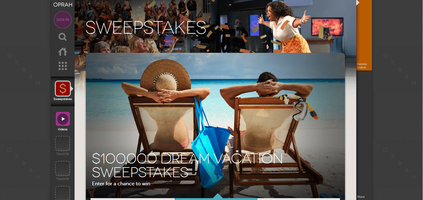
The name Oprah rings a bell, and in keeping with her brand, the landing page of her site exudes optimism and joy, showing a beaming Oprah on the page. This particular example uses entire images as their CTA buttons, so they’re virtually impossible to miss.
The page also includes a “Winner’s Circle” section where visitors can learn about previous winners of the sweepstakes. This acts the same way as testimonials and seeks to build trust.
6. Neil Patel
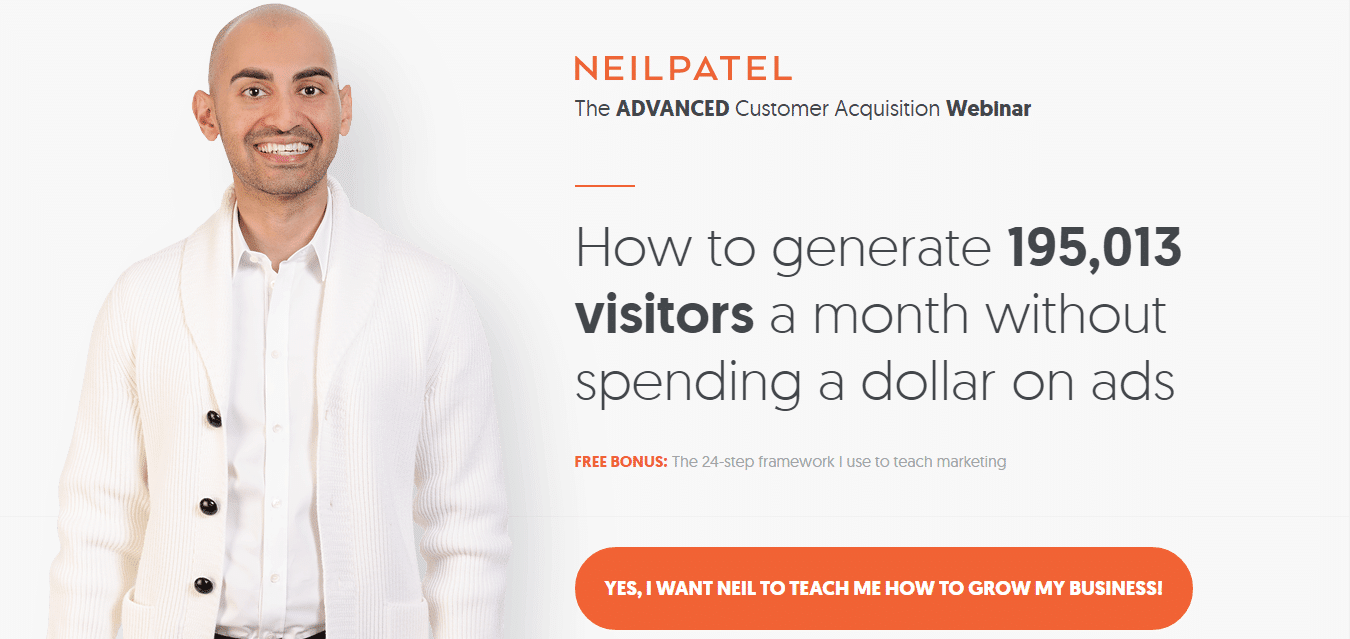
Neil Patel’s official website is another great example of a distraction-free landing page, indicating to visitors that there is only one path for progression. It displays Neil’s happy face along with a compelling description of the offer. His CTA copy within a huge orange button helps drive the point home to readers that this offer will teach them how to grow their business.
7. Bills.com
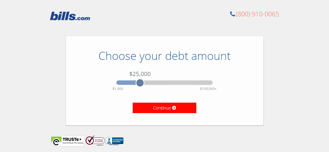
The clean and refreshing feel of Bills.com is due to the crisp white and blue layout of the landing page. The minimalist feel of the images removes all unnecessary distractions from the page and makes the red CTA really stand out. This “qualifying page” shows up before the actual landing page form and creates an air of exclusivity around their offering.
8. Webprofits
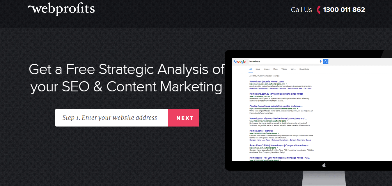
Webprofits has a grainy black and gray background, but the white text contrasts against it nicely. There is a prominent field form for the visitor’s website address and a bright pink CTA button that draws visitors toward their next course of action.
The page offers complete details about Webprofits and its services, plus multiple call-to-action buttons at the bottom of each page (“Get a Free Analysis Now”).
9. Basecamp
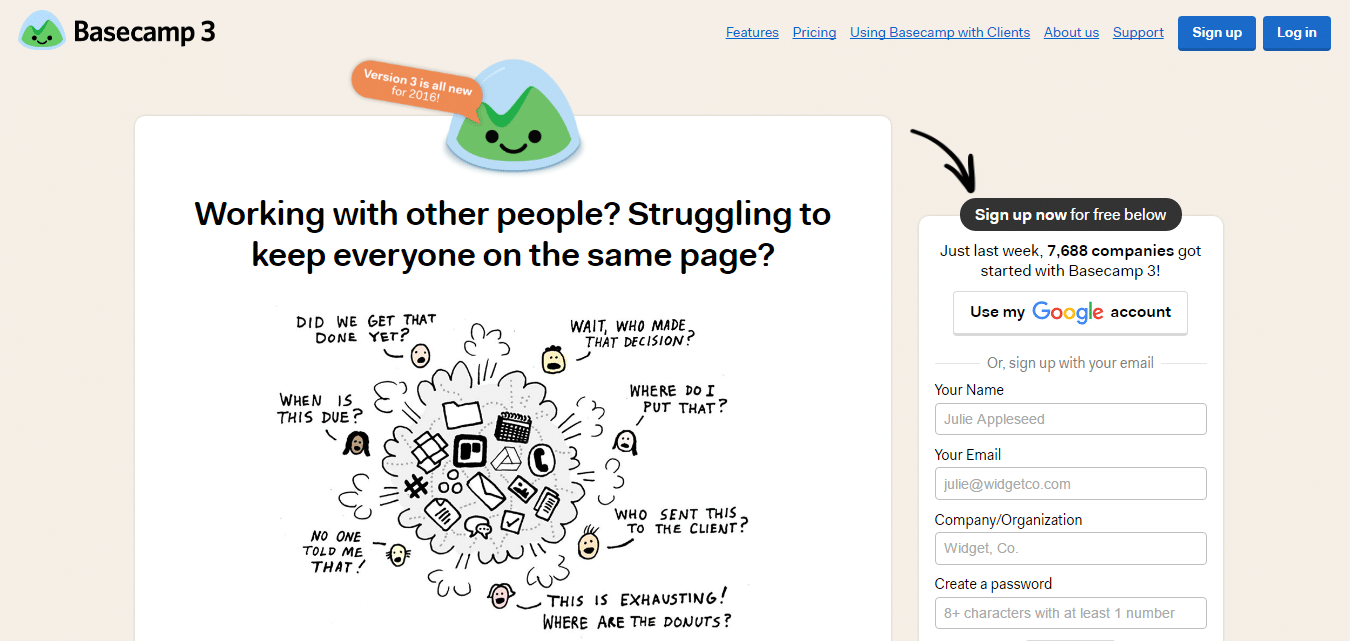
What sets Basecamp apart from the rest of the websites’ landing pages is its minimalist design and quirky cartoon characters that direct readers to fill out the form. The cartoon spices up a page that can charitably be described as dull. The form is great because it scrolls with the page as you read. It also has an arrow pointing to it just in case it wasn’t obvious enough to visitors.
10. Netflix
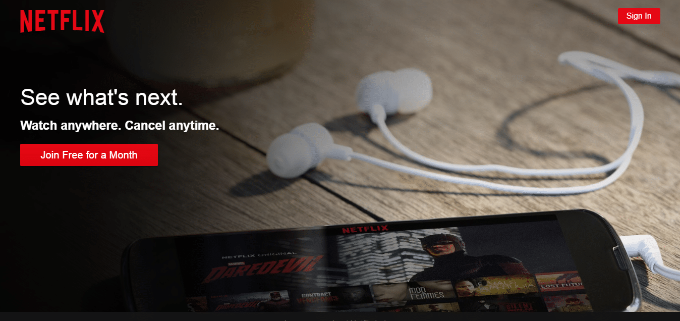
Netflix’s landing page is a great example of lean content and a compelling call-to-action. After your visitors read your headlines, they need to know what to do next. In this case, a big red button that’s impossible to miss invites users to “Join Free for a Month”. It really encompasses the essence of simple instruction and actionable copy.
Takeaway
With an impressive landing page, you can improve your content marketing conversion rates and directly increase your actual sales. If you’ve already got great content and a compelling offer but aren’t seeing a lead volume that reflects their value, maybe it’s time to start looking at landing page design.
Putting together a high-converting landing page is no easy task. Minor changes in the copy, layout, or design can mean the difference between form submissions and the dreaded high bounce rate. Make sure that you’re A/B testing each aspect of your landing page to discover the combination that works best for your specific audience.
Ready to build a high-converting landing page? Choose the right lead generation provider to work with and create landing pages that consider your audience, call-to-action, product or service, and your niche.
Related Blogs

Mastering Campaign Measurement: A Guide for B2B Marketers
Measurement is crucial for any marketing or advertising campaign to assess whether…
Read More
The Hidden Perils of B2B Data Deprecation: A Marketer’s Guide
In B2B marketing, accurate data is essential for success. However, data quality…
Read More
What is Content Syndication? The Key to Generating Leads and Increasing Conversions
Content syndication is the act of republishing your content to other websites,…
Read MoreGet the latest content from DemandScience in your inbox.
Trending Blogs
Mastering Campaign Measurement: A Guide for B2B Marketers
Measurement is crucial for any marketing or advertising campaign to assess whether your investment paid off. Here are…
Read More
The Hidden Perils of B2B Data Deprecation: A Marketer’s Guide
In B2B marketing, accurate data is essential for success. However, data quality can decline over time due to…
Read More
What is Content Syndication? The Key to Generating Leads and Increasing Conversions
Content syndication is the act of republishing your content to other websites, introducing it to new audiences and…
Read More
10 B2B Growth-Hacking Tactics for Lead Generation
Growth hacking is one of the most wide-spread “secrets” of small business start-ups. Its meaning can sometimes get…
Read More
An Inquiry vs. a Lead: What’s the Difference?
Many marketers and sales people assume that inquiries and leads are one and the same, but in fact,…
Read More
Outbound vs Inbound Lead Generation Infographic
At the beginning of every lead generation initiative, it’s important to understand the difference between inbound and outbound…
Read More
8 Lead Generation Ideas for Startups
Lead generation can be challenging for startup companies. As you build your business and its operations, you need…
Read More
10 Examples of Awesome Landing Pages that Convert
To lead more users to your products, you need to create a showstopping landing page. To do this,…
Read More
Account-Based Marketing: Is it Worth Implementing?
Account-Based Marketing (ABM) is a strategic method where marketers communicate with a defined set of accounts as markets…
Read More
Lead Quantity vs Lead Quality: Achieving a Balance
Traditional sales and marketing strategies have long focused on lead quantity by casting a wide net to capture…
Read More
What Data Solutions Mean for Marketing Technology?
In recent years, marketing has come to rely on the input of big data in order to create…
Read More